Codes are signs which have the potential for different meanings and conventions are arrangements that become habitual and accepted.
Website Analysis
Website general codes and conventions: what are they and how are they used?
-Logo placement
-Main Navigation
-Content Hierarchy
-Using a grid
-Link styling
-Buttons
-Colors
What is the difference between the homepage and the linked page? How can you see that they are from the same site (Branding)?
-The linked page has more specific information where as the homepage has the linked pages and a small little line of information on it when you hover over it. It has a banner image and lots of highlighted key information as well as a podcast on Soundcloud that the homepage does not include.
What ideologies (The values & aspirations {ideas & goals that are important to people} ) do they present to the audience? Link to target audience.
-Exams; as it is exam season for lots of the age boundary of 14-18 years old. { year 10-year13 }
-Autism & insomnia; as it is common for autism to be the cause of many things including insomnia in teenagers.
-Vaccinations; because you need most of your vaccinations as a teenager.
-Healthy eating; to lead a health life, your body needs to be healthy for a healthy mind.
-Seizures; It is common for certain teenagers to have seizures or know someone who has them, so it is important for them to know what to do in said situation.
-Body image; this is what many teenagers struggle with, so it is important to educate people on it.
-Relationships; teenagers are discovering healthy relationships at this age.
What is the logo, slogan and colour scheme? How do they all link?
The logo is the site name in all block capitals, in black and white. The colour scheme is black background with colourful images and highlights. The slogan is 'Love your body, love yourself, love health.' This all links because it all fits the same theme of easy to understand and is some what basic and not too flashy not to dull.
How do they use colour palette & Typography? { choice of font style, size, colour, etc.}
They have a plain black background with a bright and colourful picture choice for relevant images. The typography is basic and easy to read for everyone to be able to see and understand. The font is white and has certain highlighted key information or titles in bright colours.
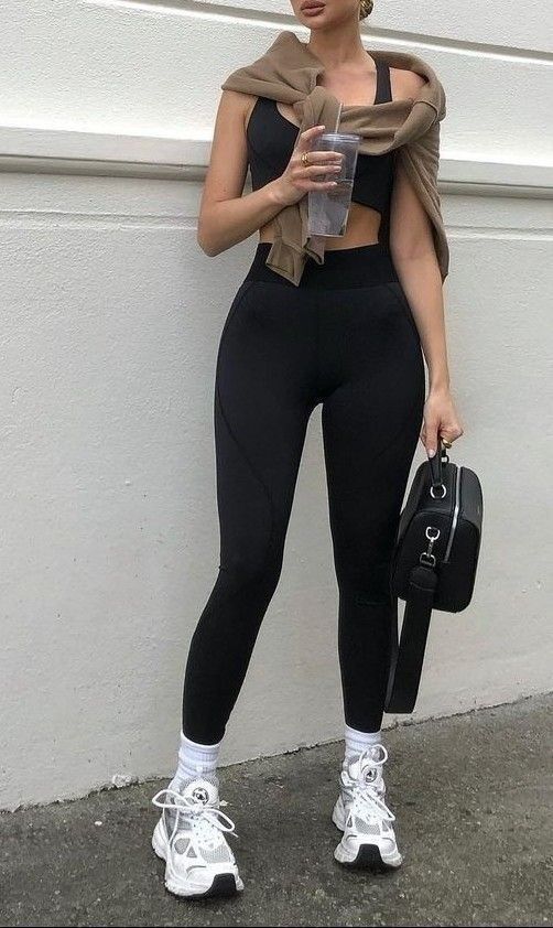
Who is the target audience and how does it appeal to them?
-The target audience is 14-18 years olds, and the name of the website is 'health for teens', it appeals to them because it is very full of important and key interesting facts about teenagers specifically. It has everything from sexual health to tooth decay and autism.
What sort of things do the images show?
-The images are bright and colourful to attract people to read and explore said website. The images show good and not toxic relationships, including holding hands, friends, football, exercise and healthy food. Some are real people and some are animated drawings of people.
If there are videos, what do they show?
-The videos show that it is common to be stressed before and after an exam, however, there are ways to manage it and it doesn't always have to be frustrating and angry, as you can make it fun and worry-less. This is because many teens waste time worrying rather than revising and obviously revising is the best thing you can do in the lead up to an exam.
Course-work Planning
LO; to plan an effective product aimed at a specific audience using appropriate codes and conventions.
Magazine & Website
-Colour Palette; light colours, neon colours, black and white, with neutral colours.
-Content; eating habits, fitness, and mental help.
-Masthead; basic, brief summary
-Home page lay-out;
Name: Pulse.
Slogan; Move your body, shape your future.
Style;
Thursday 29th June 2023
Target Audience
- Age range; 14-18 year olds. {teenagers}
- Women
- School
- Any race
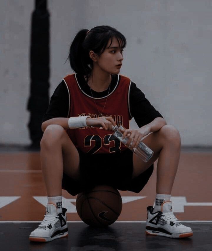
- Fitness and health & lifestyle
They could be in either a rural or urban area but more probably a urban area, as you have more access to things like gyms. However, healthy eating probably more rural, because stereotypically you are more likely to eat healthy food when you are living in a rural area.
They would most likely enjoy more sports related subjects like PE, and gym.
They would have important values of fitness and healthy eating, amongst healthy mind healthy body mind set.
They would use social media to envision themselves in the future, like mood boards and being inspired by others who are sports and fitness enthusiast as well as healthy recipes and alternatives of their favourite foods. Not looking at skinnier or prettier, or wider, or curvier people online.
Website Plan
Thursday 7th September 2023
Statement of Intent.
My brief is to create a health and fitness magazine for 14–18-year-olds; my target audience is girls who struggle with healthy eating, and healthy habits, rather than girls who go to the gym, in comparison. My website name is Pulse, and the slogan is “move your body, shape your future,” the style is minimalistic, so as to not be too overwhelming for the eye to see, however, still somewhat feminine, to appeal to women. The website will target people who don’t want to do anything extreme in the terms of fitness, but are interested in leading more of a healthy life style in return. The page I have included will target healthy eating, and eating disorders, as well as positive speech and inspiring images on the website, to make sure it isn’t hurtful or shameful, and attracts rather than dejects young girls, specifically between the ages of 14-18 years old. My logo is going to be a heart rate symbol that goes through the word, “Pulse.” The colour palette will be somewhat simple, but target girly colours, that make it more of a safe place for women, because it is women that are the target audience. The layout will be somewhat simple, and there will not be pages and pages of writing, just enough to educate you every so often, so as to not distract or bore the reader/viewer of the main point of the website. The typography will be neat and simple, yet still decorative, but still not boring and plain. This is because it is not just about the fonts and typography provided, it is about what the words say, although appearance does matter still. Mise-en-scene comes into play when I structure my website, where I place each image and word, to make sure it is the best of my working ability, once finally completed. This will appeal to my target audience, because this is comforting for a viewer to see, especially one who already feels uncomfortable in the given situation at hand, instantly appealing to younger women and teenage girls. I plan to use the stereotypes of femininity because it is likely that this is all a teenage girl would know about "female fitness", however, I also plan to use the stereotype of fitness and healthy eating to my best ability, helping it encourage that working out and keeping fit, and eating will is not a bad thing, and should not be viewed in a light that colours it to be disgusting and hard work; because this is in fact not the case, in most scenarios. I plan to use other representations of food, and fitness to show a bigger picture about what doing certain exercises and eating certain food, can be enjoyable, perhaps with a healthy mindset, even more enjoyable than sitting down comfortable in your home, watching tv, whilst binging on something that is terrible for your health, on the other hand, it may encourage people who struggle to eat enough food, and feel guilty or sad, when eating that it is okay to eat food, and stay fit, as long as you eat the right amount of nutrient and protein, as well as sugary food. Because you can’t lead a healthy life style or change unless you want to, and take the necessary steps to the right healthy lifestyle that works for you, and yourself only. This is because everyone is different in their own bodies, and we all need our own, different things to be healthy, and most importantly feel healthy in our own body and mind. Remember healthy body, healthy mind.
Thursday 14th September 2023
Coursework Review
Lo; to recap brief criteria and to explore how to create effective presentation
How is your HOMEPAGE going to follow the layout/content conventions of a homepage?
My homepage is going to follow the layout and content conventions of a homepage by including an original logo, a menu and navigation bar, a working link between the homepage and one other page.
What is your LINKED PAGE going to be about and how will it be laid out?
My linked page is going to be about healthy eating and eating disorders, it will be laid out with between 150-200 words, a 45 second video, with original audio. It will consist of feminine and soft colours, it will be laid out to look minimalistic to make sure it isn't overwhelming. The typography will be simple by decorative. It will include at least 3 original images, and have other images that I have found, and think are relevant to my product. It will also include links to social media to include relevant influencers. The pictures will include healthy foods and healthy exercise, to help shed a positive light on what I am trying to promote. The words will talk about ways to healthily get fit, and be healthy, supporting the images.
TO DO LIST;
-Plan Video
-Take photos
-Plan Photos
-Write Text
-Make Logo
-Use template {Done}
Thursday 2nd November 2023 02/11/23
Article Writing
Lo; to create a convincing article for a teen health and fitness magazine/website using appropriate language, tone and representation.
Do Now:
1. Interview.
2. Recipe.
3. Story.
4. Workout Routine
5. Diet plans.
6. Motivational Speech
7. Health Tips
8. Quotes.
9. Reviews {suggestions of brands}
10. Fact sheet
11. How to..
12. Step by step guide
13. Problem page
14. Profile
Key Elements:
-Headline
- Date
- Article
-Pictures
- Stand first
Thinking Points
-How does your homepage link to your linked in page?
My homepage links to my linked page by the general topic of womans health and fitness. This is done by the use of general health as well as fitness.
What is the article about? What type of article is it?
My article is going to be about eating disorders and food issues as well as the dysmorphia it may cause. The type of article is health tips and diet plans, as well as recipes.
What are the images going to be of, and what style?
The images are going to be of healthy meals, and fun exercises that make you want to be healthy, rather than just tell you that you need to be healthy.
Will you have the same font as your homepage?
Yes, the font will be the same if not similar, as it will fit the colours and theme that follows through the entire website. This will help make the website flow well and look good making you want to read more into it.
My article
In your teenage years, you are more than likely to become a victim to insecurities concerning your body, and possibly even develop body dysmorphia or an eating disorder. Pulse, understands these issues and how they can't always be avoided in certain situations, however, we also understand how to make those same situations better to get you back to feeling your best version of your self.
Most people believe the only way to feel good about yourself is to exercise and work out profusely, and only eat salads, drink water, and protein shakes. The truth is there is more to this than that alone. Of course working out often and eating healthy can help you, it isn't the only way, nor is it the most efficient one.
The most important and very first think you need to manage to do, is to get a healthy mindset. If you believe you can't get fit, or you don't want to commit to the time it may take, you won't ever be able to get fit.
The next thing you need to do is create a plan of what you want for your end result; everyone is different, therefore they all need different exercises, workouts, and diets, you need to try different things and eventually build your own routines.


RESEARCH:
ReplyDeletegreat research and analysis
TA PROFILE:
Good ideas
PLANNING:
A good start - which logo are you using?
I'd like to see more about how you're going to target teens specifically.